If you’re a SaaS or ecommerce marketer, improving your conversion rate will always be your top priority. It will probably be one of the last things that will ever leave your mind, until you’re old and retired and sipping mimosas on a beach somewhere. In fact, you might even be racking your brain right this moment to find out how you can not just drive more traffic to your site, but convert on that traffic and turn casual visitors into eager buyers. And this is where a top-notch landing page comes in.
Why do You Need a Landing Page?
A landing page serves several purposes: It can generate leads for future conversions, be a cornerstone of your digital marketing efforts, and build your brand. A landing page can build your customer base by leading interested customers to specific products or offers and nudging them to take the desired action.
However, it is important to note that not every landing page will do. Notice how we emphasized earlier that it should be of top quality? If your landing page was not designed with conversion in mind, you won’t get the results you need.
So, what makes a top-notch landing page? Let’s take a closer look.
What Makes a Top-Notch Landing Page?
For it to be effective, a landing page needs to be properly optimized. As such, it should be designed while keeping in mind the following best practices.
Maintain clear and consistent branding
When visitors land on your page, you want to assure them that they’ve arrived at the right destination and that they didn’t misclick. Don’t give them any reason to doubt it or you’ll risk losing the chance of converting them to paying customers as they bounce away.
To do this, you need to be consistent with your branding. Use the same logo, color schemes, and image types across all your digital assets and use the same style and voice in all your content. If the ad they clicked on discussed certain features of your product, that messaging should be front and present. Your visitors want a seamless digital experience; give them what they want and see how your conversion rates improve over time.
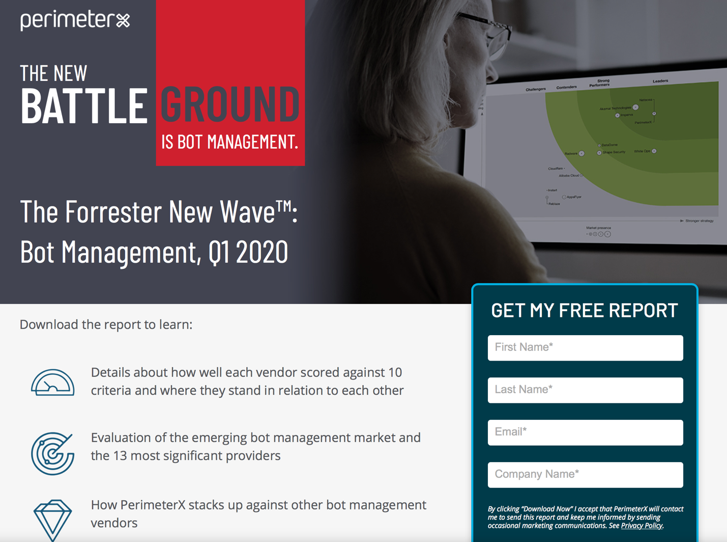
Here’s an excellent example from a SaaS cybersecurity company. PerimeterX does a great job in transitioning users from the ad to the landing page. Their ad shows up in response to a search for “bot protection software.” Upon clicking, users are taken to the landing page, which has similar messaging in the headline, consistent branding, and a clear CTA.

Have minimal to no distractions
A landing page should be designed to guide the visitor to the next step on the path to conversion, not show them a way out or accidentally lose them along the way. Thus, you need to limit the options, or better yet, provide a single course of action that will lead them straight to conversion.
Don’t make the common mistake of including a navigation bar, clickable graphics, or outgoing links on your landing page (84% of landing pages make this mistake and include a navigation bar) or your conversion rates will take a direct hit.
The landing page of the iconic Julia Morgan Ballroom in San Francisco offers visitors no distractions (no external links or navigation bar) and allows them to make a reservation through the landing page.

Offer a unique value proposition
Let your visitors know how your product, service, or offer will benefit them – and let them know about it the moment they land on your page. Put the benefits right in front of their eyes.
Let’s use the example of Seal Skin Covers, a big ecommerce brand selling car covers. Their landing page highlights the strengths of their product (multiple layers, guaranteed to fit), as well as the value of purchasing from them (a decade-long warranty) to convince someone why they should shop with them and not their competitors.

Strong and clear call-to-action
Don’t let your visitors second-guess what they need to do upon reaching your landing page. Most of them may not know what steps to take unless you tell them, so create a clear and strong call-to-action. Don’t have multiple options, either – that can confuse visitors and reduce the odds that they take any of the options presented to them. Better yet, you may want to consider using personalized CTAs, since they convert 202% better than generic CTAs.
A quick and simple conversion process
You don’t need to ask for too much information on your landing page. Unfortunately, many business owners commit this mistake, with some even asking their visitors to fill out 11-form fields. That’s way too much! Honestly, all you need is the visitor’s basic contact information to establish contact and build trust. Anything more than that can hurt your conversion.
Additional Tips to Improve Your Landing Pages
- Zero in on a single offer. Including more than one offer on your landing page can distract ya visitor’s attention and reduce conversion rates by up to 266%.
- Optimize for mobile. While mobile users contributed 56% of all website traffic in 2019, only half of all landing pages are optimized for mobile. More than half of your potential audience could be using mobile devices, so this is crazy! Mobile optimization will do much good for your bottom line.
- Make it more interactive. Since users are demanding for a better online experience, providing them with more interactive content can make things more interesting and keep them on your page. For example, using video on landing pages can improve conversions by up to 86%!
- Send them to a “thank you” page. Send newly converted leads to a specially designed “thank you” page to assure them that they completed the signup process and that you appreciate them for doing so. You can also add social media links on this page to allow visitors to connect with your company and/or share your offer with their network.
To give you more ideas and insights on how to improve your landing pages, here are some SaaS and ecommerce landing page examples that have been proven to work.
Spending a little more time and effort in optimizing your landing pages can have a positive impact on your results, so choose to do the right thing. With a top-notch landing page, you can generate more leads, sales, and profits. That’s what you’ve always wanted. Go for it.
About the author: Andy Beohar is co-founder of SevenAtoms, a marketing agency that is a premiere Google AdWords Partner and a Gold level HubSpot partner. Andy develops and manages ROI positive paid marketing campaigns for Tech, SaaS and Ecommerce companies.