Did Google’s mobile-first indexing drop your website down the SEO rankings? Are you thinking of how you can upgrade your website to maximize Google’s latest update? The requirements can be confusing, so let me walk you through on the website upgrades I implemented for my SEO.
What you’ll learn here could have an immediate effect to help your website rise up the rankings. It’s the perfect lesson for those who are just getting into web development or those who are in dire need to upgrade their website. But before I do that, let me define what mobile-first means so you have a better understanding of the reasons for my website’s upgrades.
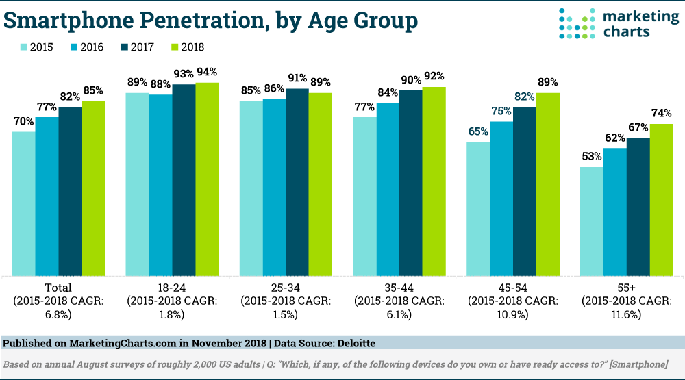
Photo courtesy of Marketing Charts
According to Deloitte, smartphone usage in the United States has steadily increased regardless of age group over the past four years.
Moreover, mobile searches have surpassed desktop queries for the first time since 2015. It didn’t take long for Google to notice this trend as it launched its mobile-first indexing in 2018. As such, the tech giant will “use the mobile version of the page for indexing and ranking, to better help their – primarily mobile – users find what they’re looking for.”
So how can you turn your page into a mobile-optimized website? Here’s how I did it.
Follow the KISS (Keep It Simple, Stupid) principle for your navigation
While dropdown menus can be great when browsing on a desktop computer, the same style of navigation can be frustrating for mobile users.
First of all, the limited space makes it hard for people – especially those with thick fingers – to tap dropdown menus. In addition, the design, more-often-than-not, won’t fit on the screen as it is. It also requires more hand movements to get to where I want when dealing with these kinds of navigation styles. As a result, bounce rates increase and average time drop. Not good for any website.
Here’s what I did to fix this:
I opted to use a vertical layout for my website’s menu and responsive design. This allows the user to clearly see the labels. Moreover, it provides them with enough space to tap where they want to. This significantly improved my UX, which decreased the bounce rates and increased the average time on the website since implementation.
The same thing can also be said with the overall layout of a website. You can expect your users to leave your website if the layout fails their expectations or is hard for them to use. A well-designed minimalist layout can help you here.
Almost all your visitors leave when loading
Did you know that 39% of your visitors will leave if the images take too long to load? And that 47% of them will wait for just two seconds for your website to load before they leave? It’s very demanding if you think of it, but that’s the reality of web development these days. Nobody likes to stare at a blank page, including me.

Photo courtesy of MarketingCharts
In the chart, you can easily see how important website performance is. That’s why it’s crucial that you know the mobile-first indexing. This will help you create goals to achieve a faster mobile-friendly website.
My website redesign checklist includes:
Reducing image size, enabling cookies/cache, and even using third-party websites such as YouTube and Vimeo to host my videos to speed up loading time. I also had my website’s code optimized to reduce backend requests and data loading.
Always think about the experience
Apart from learning how to do a UX audit of a site and website SEO improvement, the general design should be changed to focus on giving the best user experience as possible. Declutter your page of intrusive ads, pop-ups, images, and links is a good way to go.
Just take a look at the chart below:
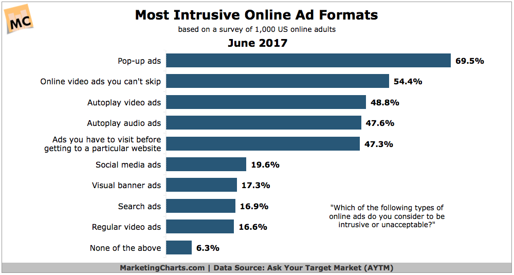
Photo courtesy of Marketing Charts
In this chart, we can see how intrusive each of the ads on any website can be. This greatly affects the user experience and bounce rate of a website. The placing of ads, links, images, and videos can also make it hard for the user to move around websites – especially those using their mobile phones.
To address this, I placed my own ads in key areas across my website in a mobile-friendly format. It’s big enough my visitors to see but easy enough for them to scroll through it. You might also want to ditch the pop-up ad as it’s a huge factor for higher bounce rates and slower loading time.
Content is always king
How do you improve SEO ranking on Google? While most of the marketers will recommend SEO boosting, it is always better to rise up the ranks organically. With Google’s mobile-first indexing, we already know that a good overall user experience is key to be placed better in the search results. More importantly, Google is also cracking down on content quality as well.
Good content planning and execution are also needed for website SEO improvement. First of all, I learned to write to my website’s niche. I just can’t write about family, love, or cars and expect to get the same reaction from my blogs about marketing. I also needed to make sure that my articles can be easily read and are keyword rich.
Another technique that helped me was learning how to milk the cow so to speak. When I write about a certain topic, I try to produce as much content about it as I can. I look for another angle, create tips, answer frequently asked questions, or even shoot an instructional video. You can even make an infographic. Unleash your creativity. The sky’s the limit.
With the advent of mobile-first indexing, rising up the ranks on Google’s search results is no longer a keyword battle, it’s now about who can provide the best overall experience for users. It’s also a race of who can adapt Google’s updates faster.
In the end, all of this hard work web developers, SEO specialists, content creators, and even marketers like me put in is for the users. And although I’ve recently just implemented these upgrades myself on my website, I can’t wait to see the data and find out how my website users respond.
About the Author: Aby League is has a Masters Degree in Biology. But is a qualitative researcher and a passionate writer. She runs the blog About Possibilities, writing mostly about health, psychology, technology, and marketing.