A strong design leads to signage that’s more engaging and persuasive. Color plays a huge role in this, as it helps your sign stand out, enhances its readability, and reinforces your message.
In fact, a study from The University of Winnipeg revealed that customers make up their minds about a product within the first 90 seconds of seeing it. Up to 90% of that snap judgment is based on color alone.
Needless to say, poor color choices will work against your business. And for your signage to be effective, you need to know how to design it better.
Color Psychology
Color psychology studies how color affects people’s behavior and decision-making. It can be applied in a variety of industries like education (e.g. colors inside a classroom to facilitate learning) and visual arts (e.g. colors in film to symbolize certain emotions).
It is, however, most widely used in marketing to generate higher conversions.
Brands can be perceived in a certain way with the right color. For instance, you can attach a personality to an otherwise drab logo via color and make it appeal to a younger audience. You can also change the color of your product’s packaging to strengthen customer trust.
By knowing how to use the right colors for your marketing paraphernalia, you’ll be able to establish a deeper connection with your target market.
Effective Use of Color in Sign Design
The effective use of color will help your sign stand out among a sea of competing for signage. When in the process of designing, you should prioritize the principles of visual appeal and accessibility so your message will reach your target audience.
To achieve that goal, follow these steps:
1. Know Your Customers
Color psychology, at times, invokes controversy as it doesn’t take into account several factors that could also affect people’s color perceptions. This includes their gender, culture, country, region, and upbringing.
For instance, white means purity or innocence to the Western world, but it means funerals and mourning to some countries in the East. Green is often associated with the environment, but it could also relate to political movements in Europe.
That’s why any marketing campaign, including sign design, should begin with having a deep understanding of your target audience. Knowing who your customer base is—their demographics, environment, culture, etc.—will let you pick colors that will trigger the right emotion.
2. Understand Color Lexicon

Source: Lifehacker
To the uninitiated, picking colors may be a daunting task. Start with knowing the terms that are often used in this process:
- Color wheel — A wheel with 12 colors used as a guideline when combining colors
- Hue — All 12 colors on the color wheel
- Tint — The product of adding white to hues (e.g. pastels)
- Shade — The product of adding black to colors
- Tone — The product of adding both white and black to colors to tone them down; considered to be more visually appealing than full colors
- Saturation — The intensity of a color from pure to gray to light
- Chroma — The purity of a color (e.g. high chroma has no black or gray)
- Contrast — The difference between colors
Source: Lifehacker
- Primary colors — Red, yellow, blue
- Secondary colors — Orange, purple, green
- Tertiary colors — Red-orange, red-purple, yellow-green, yellow-orange, blue-green, blue-purple
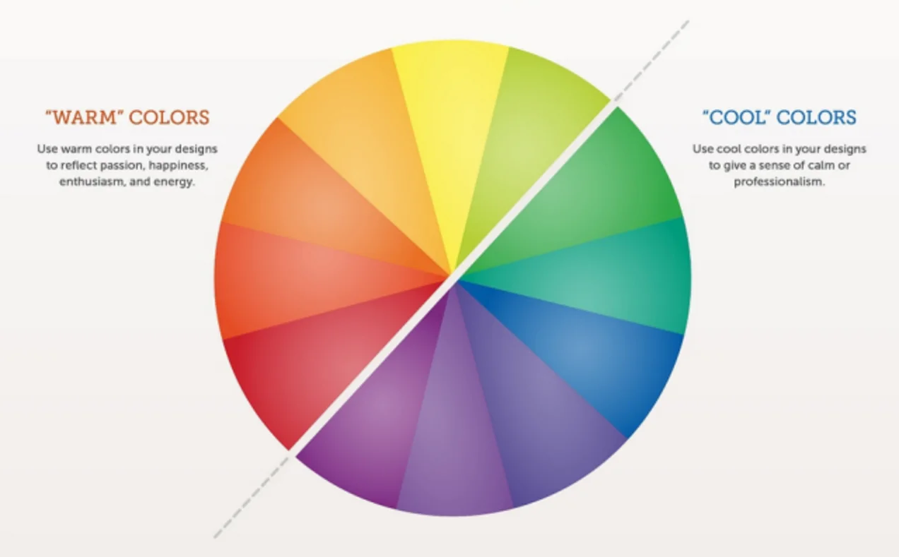
- Warm colors — colors that exhibit energy, joy, excitement, and other positive emotions (i.e. red, orange, yellow)
- Cool colors — colors that convey calmness and peace; these are also associated with winter, nighttime, or sadness (i.e. blue, purple, green)

color schemes
(Source: Lifehacker)
- Monochromatic — Using a single color and its variations
- Analogous — Three colors next to each other on the wheel
- Complementary — colors opposite each other on the wheel
- Split complementary — Pick one color, go to the hue across it on the color wheel, then pick the two adjacent to it
- Triadic — Three colors equally apart on the wheel
- Tetradic — Four colors composed of two sets of complementary colors
3. Know the Effect of Each Color to Your Customers
Picking out colors isn’t as easy as choosing the first one that appeals to you. Remember that it, ultimately, has to appeal to your target market. These colors also have to represent your brand and convey the right message:
- Red — Symbolises love, passion, and intense emotions. Restaurants use red, as it stimulates the appetite. This color is also advisable for clearance sales, as these can encourage impulsive shoppers.
- Yellow — Represents cheerfulness warmth, youthfulness, and optimism. It also stimulates a person’s nervous system and mental faculties. Window shoppers find this color eye-grabbing. However, it can easily cause strain to the eyes and known to make babies cry.
- Blue — Associated with water, the sky, calmness, and peace. It’s the most used color for offices, as it stimulates productivity. Corporate brands tend to pick blue to create feelings of trust, security, and non-invasiveness.
- Orange — Represents excitement, warmth, and enthusiasm. Brands use orange to exude feelings of confidence and friendliness. It’s also often used in signs for caution. Calls-to-action are found to be more effective when they’re orange (e.g. Subscribe, Buy Now, etc).
- Green — Associated with nature, environment, health, money, and growth. Stores use the color green, as it helps alleviate stress and depression.
- Purple — Has long been the color associated with royalty and wealth. Brands that pick this color have a creative and wise personality. You’ll also see purple in beauty products.
4. Pick The Right Color Palette for Your Sign
Now that you have a better understanding of terminologies and each color’s effect on customers, you can pick the palette for your signage. This palette will determine which colors you’ll use for your sign’s background, text, and graphics:
- Contrast for Foreground and Background
Contrast can make the difference between a legible and unreadable sign. Make sure your target audience will be able to easily focus on the main message. The general rule of thumb is to use light text on a dark background or vice versa (i.e. complementary colors).
- Light Reflectance
Understanding the principles light reflectance will help you calculate the brightness differential between colors for better legibility.

Source: Shield Co
This method states that a brightness differential of 70% or more will give you the best legibility, while color combinations with less than 70% will not be legible. For instance, using the table above, a white background and a darker shade of purple for text will work great together.
- Signage Purpose
Consider the purpose of your sign. If it’s going to be in an office space, focus on your branding colors. If it’s going to be in a restaurant, choose a red palette as it stimulates appetite (but make sure you stay on brand). In places where you need to give a sense of authority or reliability (e.g. universities), you may want to choose colors that exude trustworthiness (e.g. blue).
- Photographs and Colors
You also need to consider any photographs that will be on the sign. It will be hard to read any text that overlaps an image if the color choice is wrong. Similar to the guide on foreground/background, use a contrasting palette.
Design Your Sign With the Right Colors
Before you install your sign, test it first. Create mock-ups or prototypes, send them to a segment of your audience, and then ask for feedback. Optimize the design until you’re sure that your audience feels the right emotion and receives the right message.
About the Author: Adam Vanovitch is the Managing Director of W&Co, a UK based digital display and signage company. You can connect with W&Co on Facebook, Twitter or Instagram.